
3D model making
During our first lesson this semester we got the assignment to create 3D models using different materials that were assigned to us. The material we were supposed to use was the computer, we decided to use photoshop because we had too little time to start getting to know a new app. First we used the brush tool to draw a 3D model but the lines didn’t look clean and straight enough. We were then allowed to go steal materials from the materials that were assigned to our classmates. We decided to steal this wooden craft stick. We took a picture of it, used the quick selection tool to remove the background and started placing them in the shape of a 3D square.

We struggled because some of the tools weren’t working properly. The eraser didn’t erase the outlines which made the background not look clean. But we continued putting together our shape as our time was short.

We decided to create a 3D triangle on top of the square to make it look like a house with a roof. Reflecting on this task I enjoyed having to work in pairs as it made me get to know more people and share ideas and brainstorm. We struggled mostly with time as we only had 15mins to finish this task. I think if we had more time we’d manage to have a cleaner background and a less simple shape.

weekly reflection
Our second semester officially began today, with the art workshop being our first class.
Our first assignment, which was to make a 3D model, tested our creativity and gave us a chance to engage with our classmates and get to know the newcomers.
We were put in pairs and started the process of trying to create a model using computer- aided softwares. The first few minutes were not clear as we were experimenting with different softwares trying to find one that we felt comfortable with, as the time was also running out.
We learned that we had to combine our ideas and brainstorm together to finish the task.
I found myself getting to know my classmate on a deeper level. The experience of overcoming obstacles and exploring different ideas made me learn how to lean on each others strengths and navigate through the challenges together.
Further on we had the chance to incorporate materials from other groups into our design which made it a lot easier and created new ideas.
This experience showed how much collaborating with someone can make the process easier, and improve the designs.
All in all I think this lesson made us not only get to know each other better but also rely on one another and learn how to brainstorm and collaborate and help each other.
Reflection on last semesters project
This final project allowed me to create a narrative piece of jewellery that tells my story. It gave me the freedom to experiment and create a project that has a deep connection with me. Throughout this project I found a lot of satisfaction in the process of connecting different elements to convey a certain story.
I particularly enjoyed the integration of symbolism into my design. Each material used held significance contributing to the narrative woven into the piece.
The use of symbolism in my design was one element that I really liked. Every component that was used had a purpose and added to the story that was woven together throughout the work. My understanding of the expressive potential of symbolism in art has grown as a result of this process, which gave the finished piece more depth and flavour. But looking back, I see that if I had taken inspiration from a larger range of sources, my research of symbolism could have been more broader. Even while I did research, I admit that exploring other options like going to museums and reading a lot would have expanded my source of ideas and inspiration and allowed for a deeper narrative. Also looking at more artists work would have exposed me to new materials and techniques I could’ve experimented with more.
Over the course of the project, time management became an important issue. I struggled with a sense of pressure as deadlines approached, which made it difficult for me to really consider and develop my ideas. This rushed procedure affected the creative process, which made me feel dissatisfied with several parts of my work. Going forward, I intend to manage my time so that thorough research, experiments, and improvement is possible.
When I think back on the workshops I attended this semester, I see unexplored possibilities to incorporate what I have learned into my project. Even though I played around with different materials and learned some Photoshop techniques, I now see how much more I could have done with these tools to improve my presentation and creative process.
Specifically, I want to use my Photoshop skills to make visually appealing presentations and mood boards that inspire.
Also, I recognise the importance of pushing the boundaries of standard materials and methods, encouraging experimentation as a way to promote creativity and originality in my work.
The print workshop was a particular challenge because I found it difficult to incorporate into my project. I’m determined to get past this obstacle in the following semester by actively looking for ways to use printmaking methods in my creative process. I want to take full advantage of this form of art by experimenting and , broadening my creative ideas and improving the level of detail and depth of my work.
In summary, I’m proud of the story and meaning I put into my jewelry piece, but I know there are areas where I can do better. I need to manage my time better, try new things, and get inspiration from different places. By doing this, I believe I can improve my creativity a lot.
Tetrapak print
The tetra printing process, also known as tetrapak printing, is a method of printing on packaging materials, typically used for cartons commonly seen in the packaging of liquid products such as milk, juice, and soup. Here are the basic steps and techniques involved in the tetra printing process:\
- Preparation of Design: The process begins with the creation or selection of a design to be printed on the packaging material. This design can include branding elements, product information, graphics, and images.
- Color Separation: The design is then separated into its individual color components using specialized software. Each color is assigned a separate printing plate, which will be used in the printing process.
- Plate Making: The separated color components are used to create printing plates for each color in the design. These plates are typically made of metal or polymer and contain the raised image of the design to be printed.
- Printing: The printing plates are mounted onto a printing press, which is specially configured for tetra printing. The packaging material, typically a laminated paperboard, is fed through the printing press, and each color is applied sequentially to the material.
- Ink Application: In the printing press, ink is transferred from the printing plates onto the packaging material using a series of rollers. Each roller applies a different color of ink to the material, following the sequence determined by the color separation process.
- Drying and Curing: After each color is applied, the packaging material passes through drying and curing stations to ensure that the ink sets properly. This prevents smudging and ensures that the colors remain vibrant and durable.
- Finishing: Once all colors have been applied and dried, the packaging material may undergo additional finishing processes such as coating, laminating, or varnishing to enhance its appearance and durability.
- Cutting and Folding: After printing and finishing, the packaging material is cut and folded into the desired shape and size to create the final carton or package.
Experimentation
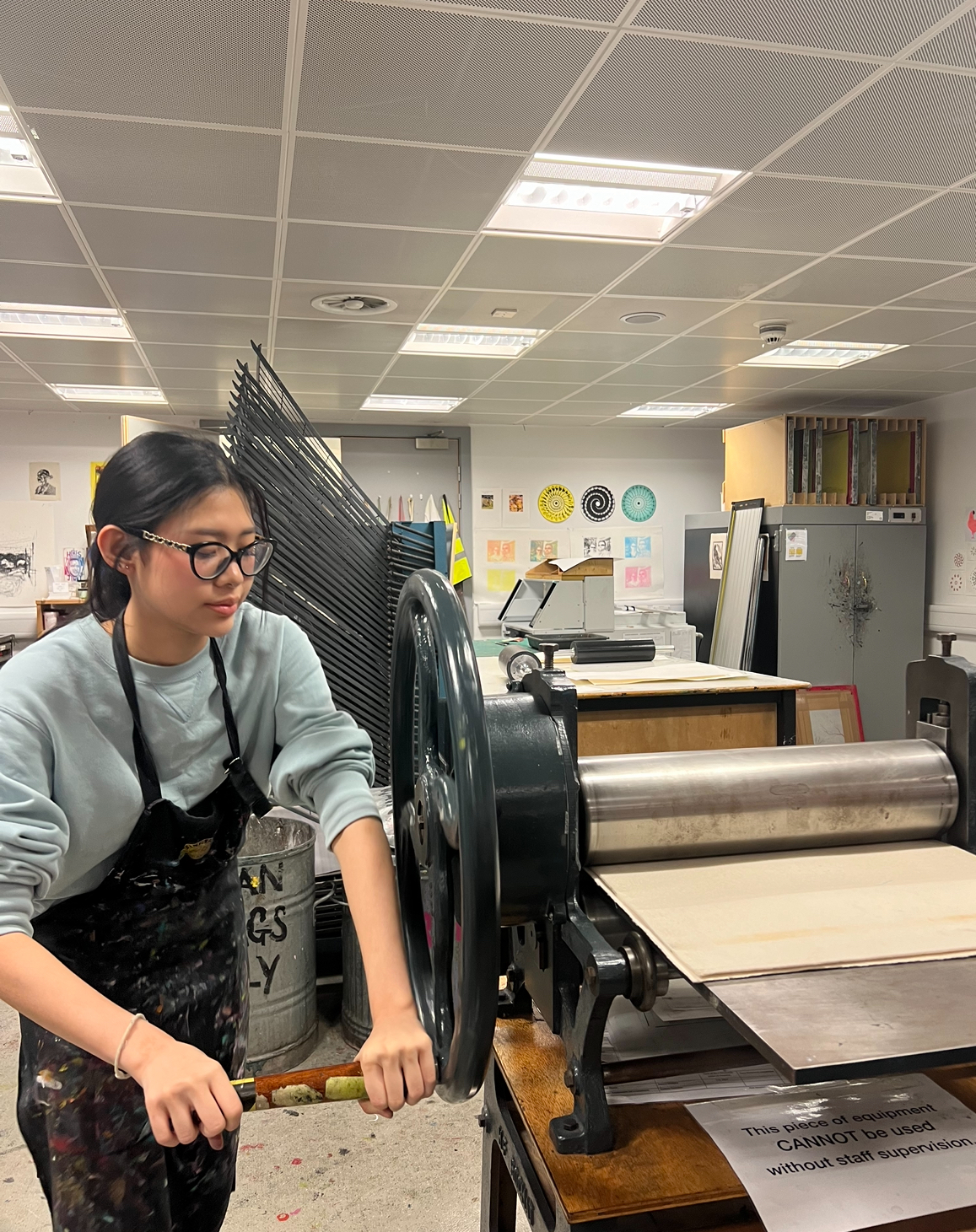
After we inked it up we put it in the print press

Construct and deconstruct
Construct: To build or form by putting together parts
Deconstruct: To take apart something
Dafna Talmor
Dafna Talmor is a visionary artist whose work transcends traditional boundaries of photography. She draws inspiration from landscapes she has captured while traveling. Talmor said she feels overwhelmed when she’s outside she feels like there are endless possibilities and no limitations. Her work is all about deconstructing pictures of landscapes and using them to create a new space that only exists in photography. Her goal is to create a utopian place that is somehow rooted in reality.


Talmor starts off by taking photographs of landscapes using the traditional film techniques , to give her images a nostalgic and deep feeling

She then uses a layering technique where she overlays multiple exposures and plays with the opacity constructing utopian landsapes that are still rooted in reality.
In addition, Talmor uses digital modification as a means of expression, playing with angles, colours, and textures to create a surreal feeling. The end product is a collection of work that defies conventional ideas of photography and attracts viewers to enter an alternate universe where the lines separating the imagined and the actual are wonderfully blurred.
Task
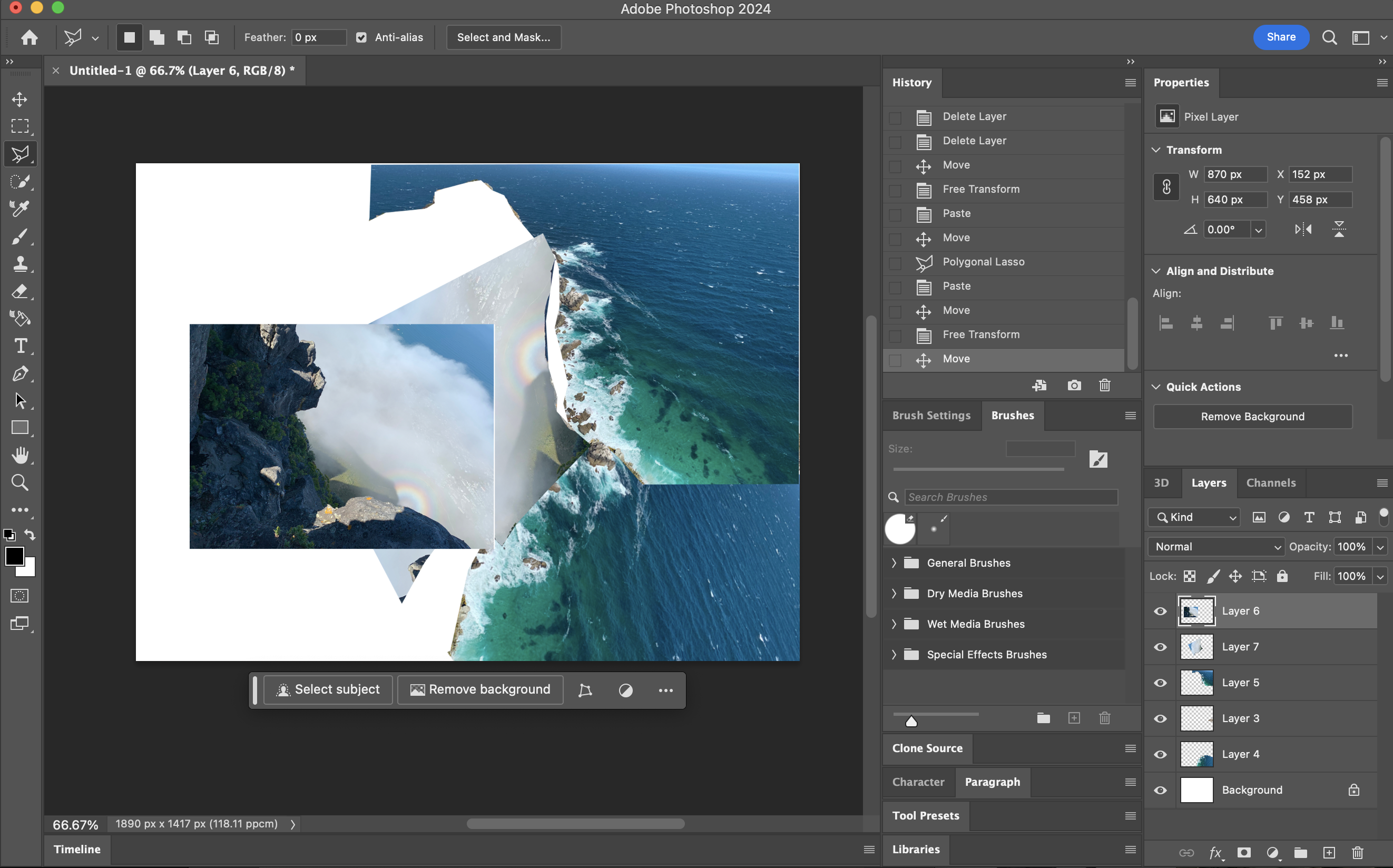
During our lesson we were asked to deconstruct pictures we had taken and construct new pictures using them. I decided to use pictures of landscapes I had taken while traveling
Reflection on the first attempt
This was my first attempt so at first I struggled a bit to create a creative and innovative design using photoshop. I wasn’t getting ideas on how to create something that also connects to my theme. But after going through my pictures I realised that they portray a journey as well so I decided to put pictures together to show my journey. This task was quite new as we were deconstructing things to create new ones. The concept felt new and foreign but after this attempt I felt a bit more familiar with the process. This piece didn’t feel very creative it felt like more of a collage than a new landscape. I also didn’t play around with exposures and opacity which is something I wanted to try.
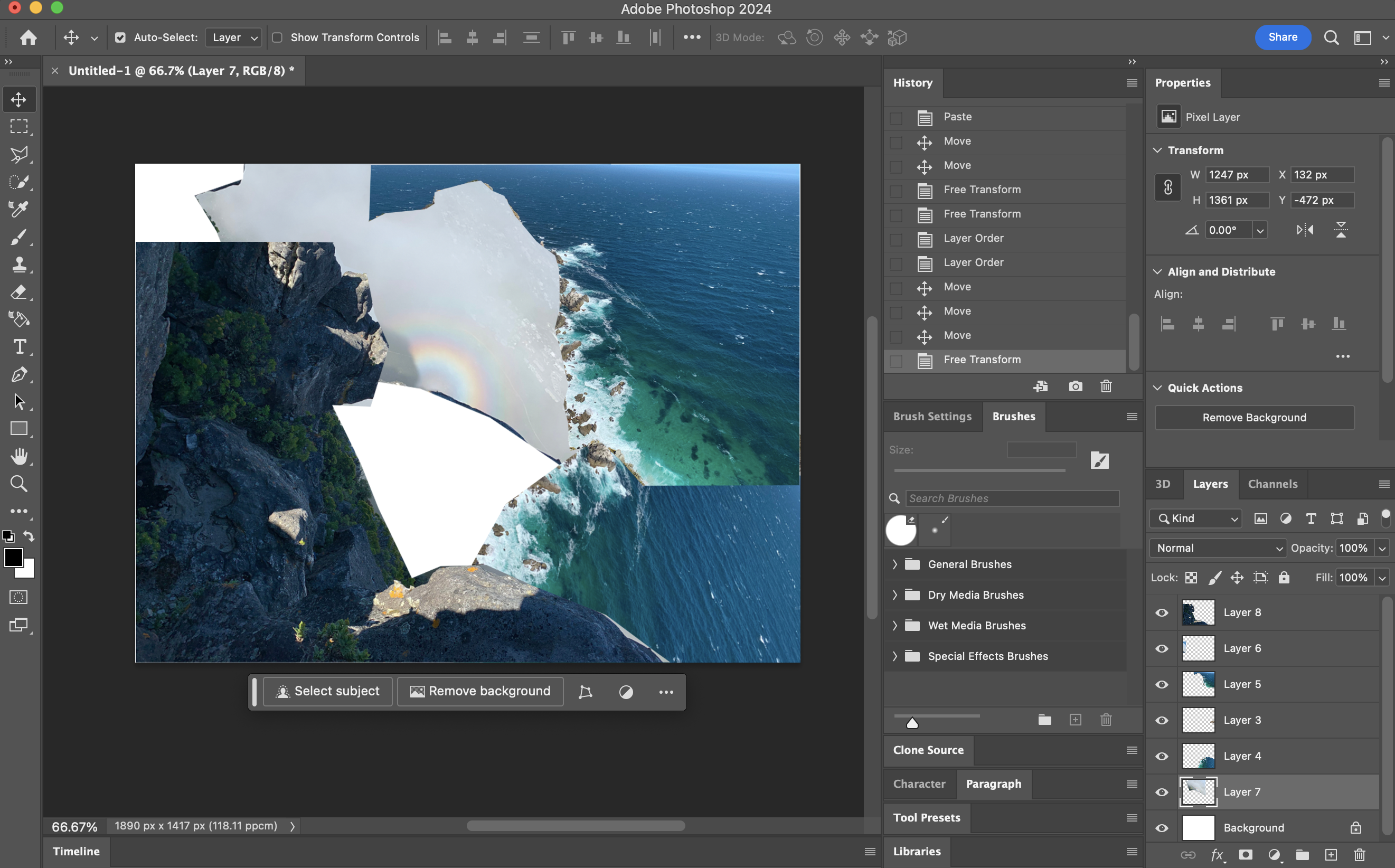
This was my first attempt for this task. Using the lasso tool I selected the pieces I wanted to cut off the pictures and added new ones creating a new landscape.
My word is strengthen. I believe that everyone has a journey they go through and that the things they experience during that journey strengthen them. This piece is suppose to portray a journey, as it’s made out of pictures that I had taken while traveling. Just like an inner journey helps you grow from experiences an outer journey like traveling, seeing different cultures helps you grow as a person and get inspired by things and people with different experiences.
second attempt
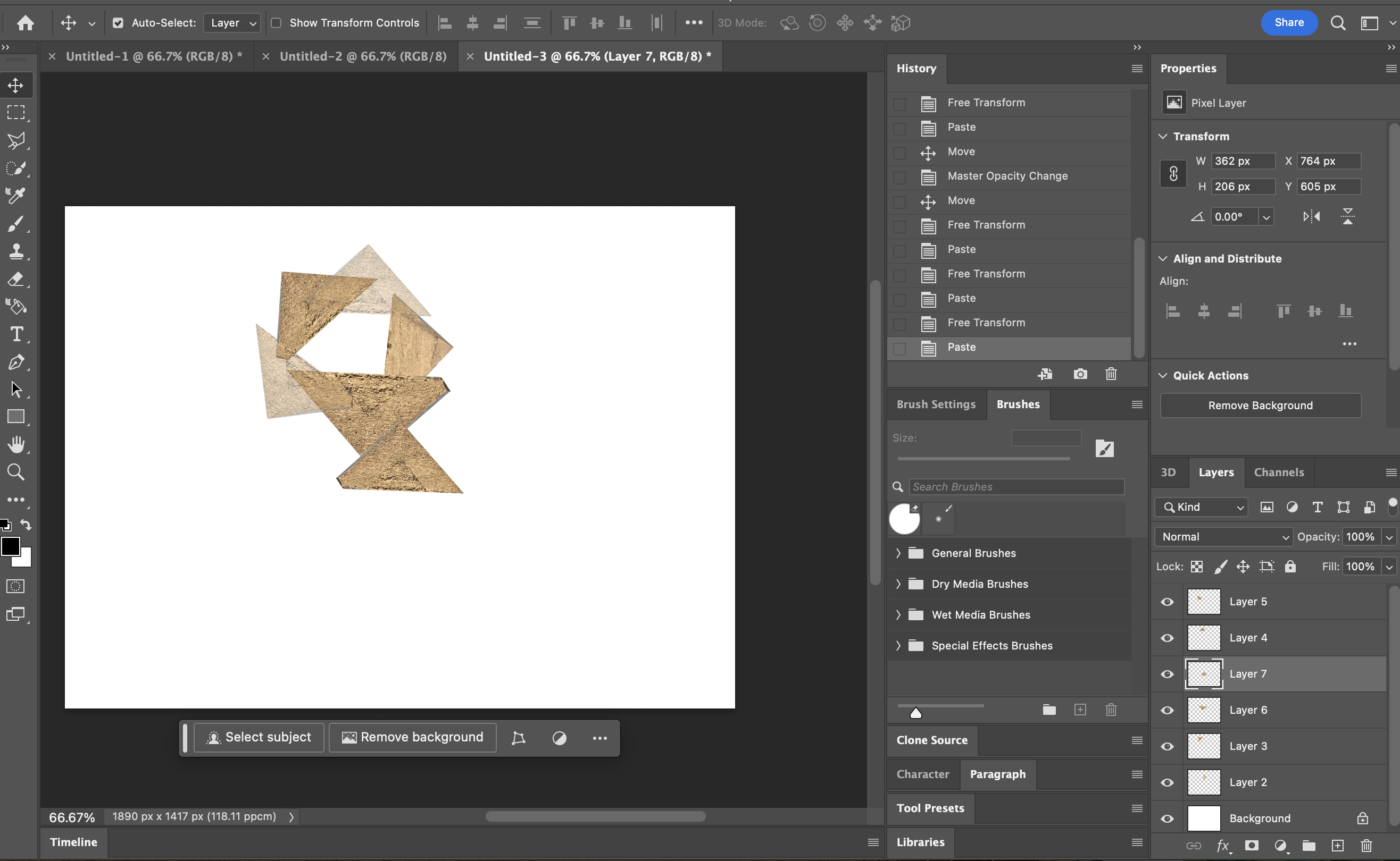
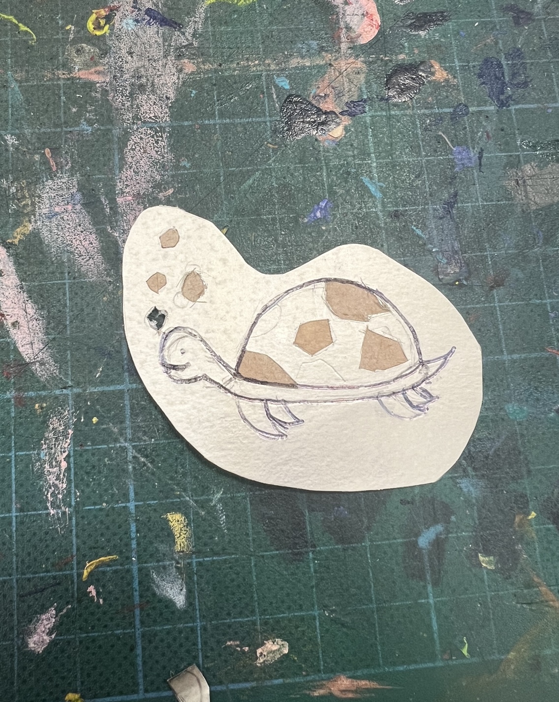
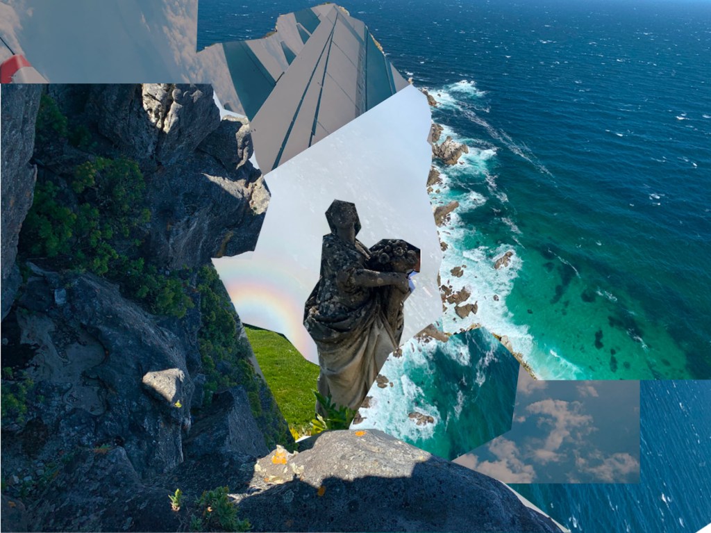
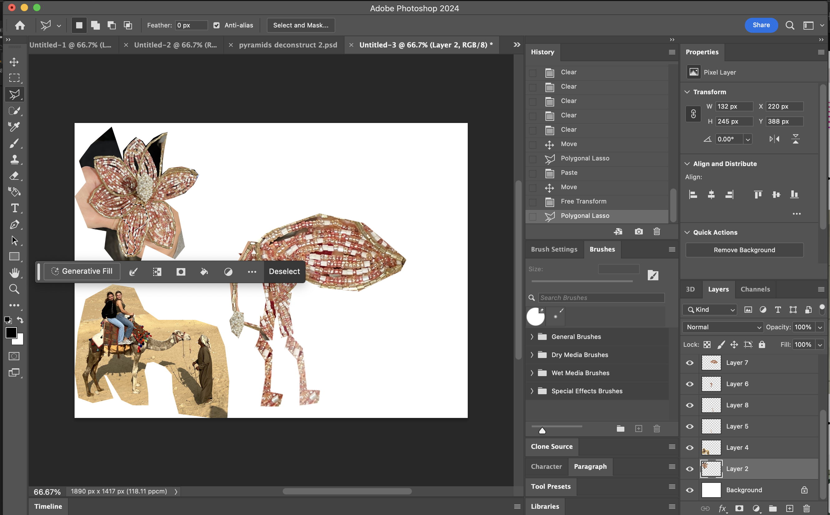
For this one I chose a picture of the pyramids to deconstruct and construct. First I cut out the pyramids using the lasso tool and then I decided to place them in a circle and play with the opacity. My initial idea was to create a flower using the pyramids but I didn’t quite manage so I just placed them in this shape which I feel gives it an abstract look.
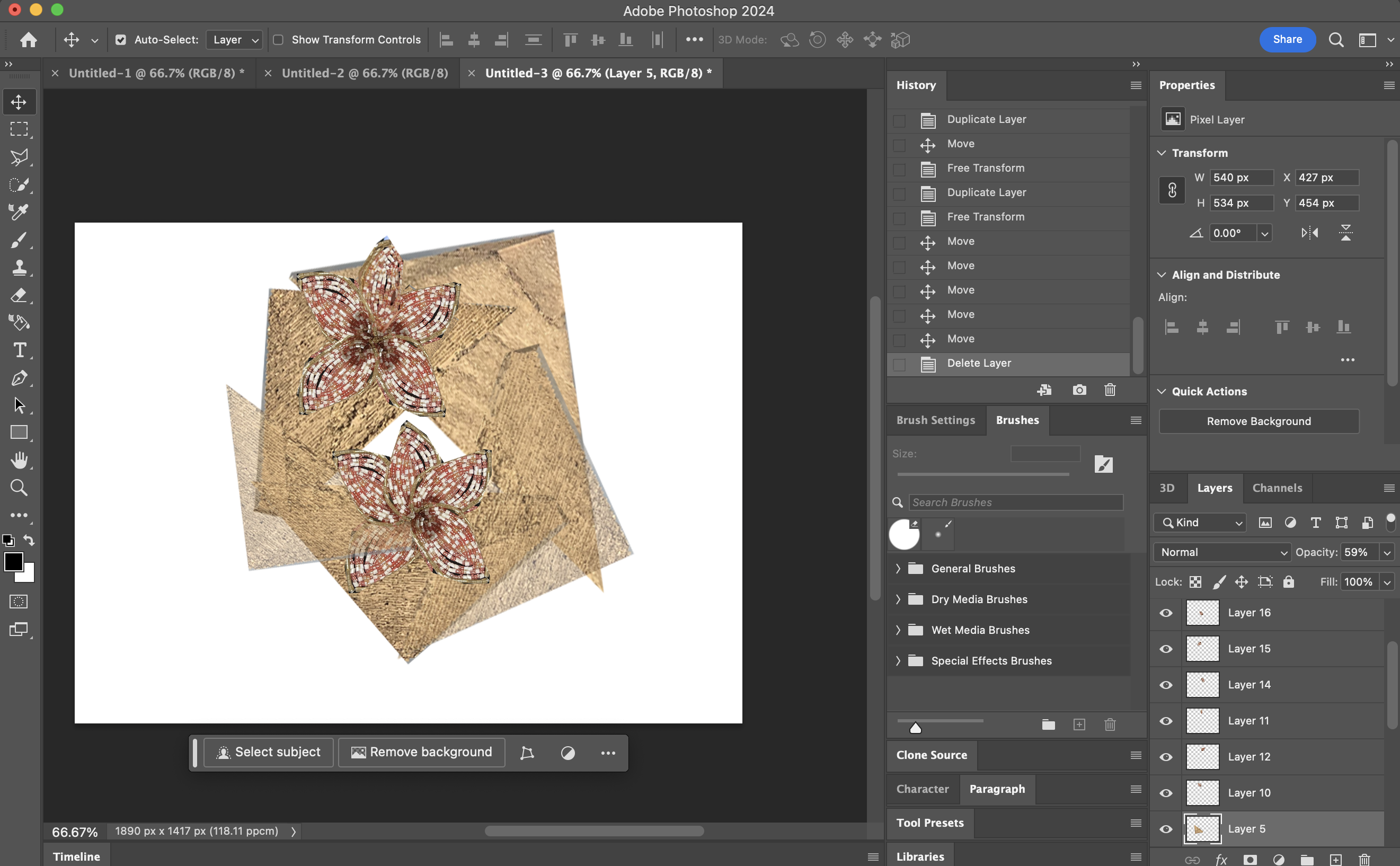
In the picture I used there was flower made out if beads so I decided to deconstruct the flower also by cutting the shapes using the polygonal lasso tool and placing them in another flower shape.
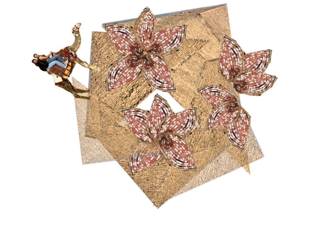
This was the finished design. I decided to add a camel to give it a more deserty feel. In the desert with the dry weather conditions you barely get any flower growth. By placing the flower on the pyramids I’m trying to symbolise that rough situations make a person grow and become the best version of themselves.
Reflection on second attempt
This one was by far my favourite one. I enjoyed how I was able to connect the symbolism to my theme and project. Also playing with the opacity gave it a more abstract and unique feel which I also quite liked. What I wanted to improve was that I wanted to construct something new by only deconstructing one picture. For this piece I had also used two pictures (One for the desert and pyramids and another one for the flower).
Third attempt
For this one I decided to only use the picture of the flower to create a camel. I put a picture of a camel next to me so could see which shapes I needed to cut. Also using the polygonal lasso tool I started cutting up shapes and placing them to create the shape of a camel.
Reflection on third attempt.
I am quite satisfied with how I stuck to the goal I had set for myself which was creating something using only one image. Also the symbolism and connection to my theme is interesting as it also portrays my identity and culture. As an Egyptian I know how well Egypt is known for its deserts, pyramids and camels. I think I could’ve done it more creatively like maybe instead of the camels hump I could’ve created a flower. I also struggled with cutting exact shapes to make the camel look more realistic, but I’m satisfied with how he turned out. The abstract look creates more room for interpretation.

I tried to play around with the opacity and overlaying some shapes but I didn’t like how it ended up looking so I decided to stick to the normal and not to play with the opacity.

This was the final design. I was quite satisfied with how I managed to create a camel using only one image which was a flower. I find it interesting that I deconstructed a picture in a way that now no one can tell what it was originally. Creating a camel out of a flower again connects the desert with flowers. Which showcases how people grow in hard circumstances.
weekly reflection
During our lesson we were asked to deconstruct pictures we had taken and construct new pictures using them. I decided to use pictures of landscapes I had taken while traveling
Reflecting on what I learned in this lesson, I see how valuable it is to break down and experiment with ideas in design. It’s like taking one idea and turning it into many different ones by playing around with it. I want to try this approach in my own design work, creating lots of designs inspired by the same initial idea. By breaking apart the original concept and mixing up its parts, I can come up with a bunch of new designs.
Also, I picked up some useful Photoshop skills in this lesson, like playing with the opacity of images. This skill will help me make my jewelry designs look more realistic, giving them depth and shadows to make them pop.
Looking back, I realize I could have been more adventurous in exploring different Photoshop tools. I tend to stick with what I know, but I want to change that. I’ll make an effort to try out new tools and techniques to expand my skills and discover new ways to create more creative designs.
Colour theory
Introduction to colour
What does colour mean to you?
To me colour is what creates the aesthetic of something. It shows what emotions are being portrayed for example.
What is colour?
Think of color as the way our eyes and brain interpret different types of light. When light hits something, it can bounce back in different ways, creating what we see as color. So, color is basically how we see light interacting with the world around us.
How did it start?
Isaac Newton shot white light through a prism and got back a rainbow colour. He then made a colour wheel, a pie chart which shows how powerful each colour shines through the prism. Over the years this colour wheel developed

Using the three primary colours (blue, yellow and red) you can create any colours. The secondary colour are the colours created by the primary colours. Using the secondary colours you can create different tones of colours which are the tertiary colours.
Understanding The Terminology
Saturation: This term refers to the intensity/purity of a hue.
Value or Tone: The term refers to the degree of lightness or darkness of a colour
Tints and Shades: A tint is made by adding white to create a lighter version of acolour. An example of a tint is pink. Pink created by adding white to red.
A shade is created by adding black to darken a colour.
Colour Temperature: Warmer colours are red tones which seem welcoming, cozy and comfortable and the colder colours are the blue tones which seem not welcoming and not comfortable.
Monochromatic colours: Monochromatic colours are shades and hints of the same colour.
Colour in detail
First we started off by all calling out words that come to our minds when we think of each colour and wrote them on the board.
I didn’t get to take pictures of every colour on the board but I wrote it down.
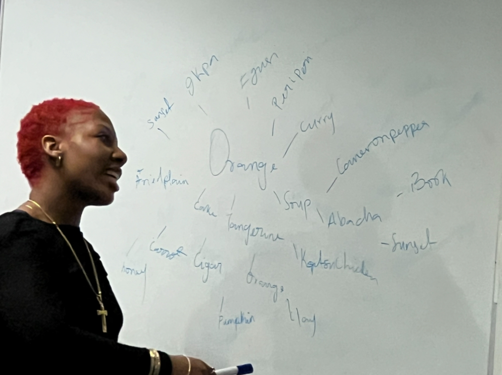
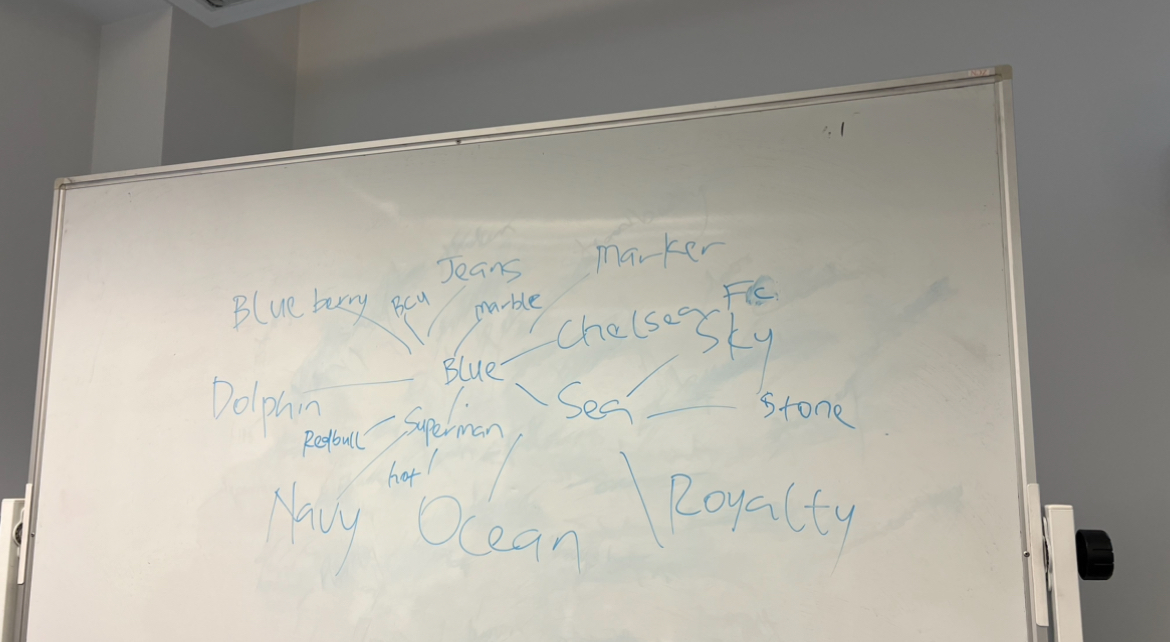
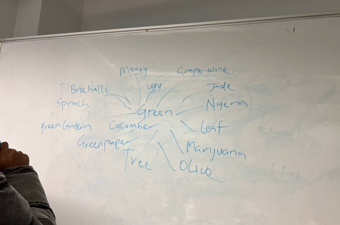
Here are the words for the missing board pictures
Red: Danger, Valentine, Anger, Love, blood, Kfc, Lipstick, Apples
Yellow: Banana, Bee, Gold, Pineapple, lemon, sand, sun, beach
Pink: Flowers, Flamingo, Summer, Bows, Dress, blush, love, pink lemonade
Grey: UK, cement, dust, old age, ashes, silver, white gold, clouds
Black: Elegance, sexy, horror, strong, devil, Bhavik’s favourite colour, Ink, Oil, Sky, Venom, Space, Charcoal, Shadow, Spider
Orange: tangerine, sunset, ginger cat, halloween, pumpkin, cake, carrot, cigarette, warmth, happiness
Blue: Chelsea FC, Sky, Sea, Ocean, Royalty, Blueberry, BCU, Dolphin, RedBull, Jeans, Sapphire
Green: recycle, Grass, Weed, Matcha, Tree, Green, Pepper, Money, Emerald, Olive, Pistachio
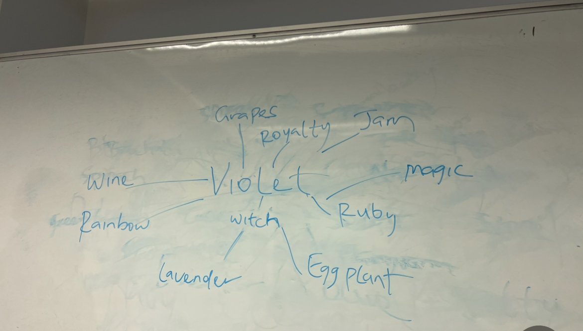
Violet: Aubergine, Grape, amethyst, lavender
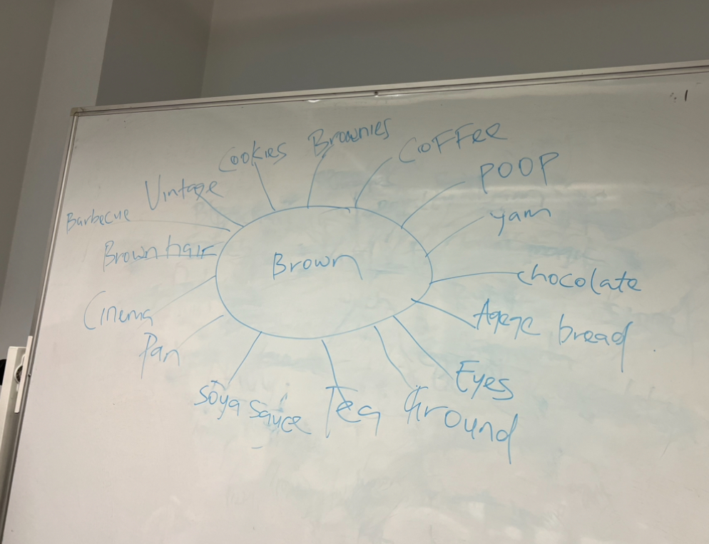
Brown: Coffee, Soil, Chocolate, Brownies, Eyes
Psychology of colour


weekly reflection
During this lesson we got to learn about the colour theory which I found quite fascinating. As we learned about the psychology of colour and which emotions are associated with every hue, I found myself thinking about my final project and which feelings and ideas I wanted to portray.
I felt like connecting the colours and choosing materials accordingly.
The task we got after was also very inspiring. We were asked to design or create a jewellery piece that is connected to the colour theory. We were put into pairs once again and I got to work with my classmate jenny.
I felt like working with her made the process of getting inspired and creating an idea much easier. We started by creating a mind map with all our ideas and narrowed it down to which idea we liked the most.
We divided the tasks based on our strengths and weaknesses and were very proud of the outcome. We had planned to not only design but also make the piece of jewellery but didn’t get the time to do so.
All in all this lesson was very inspiring and knowing that I can work well with jenny and brainstorm good ideas, showed me that asking people for their opinions and creative ideas will nurture every project.
Task
During this lesson we were asked to create a jewellery piece or an object that is connected to the colour theory and also to our chosen words.
This task was supposed to be done in pairs. Our pair consisted of Jenny and Farida.
To figure out what we want to design and create we started brainstorming some ideas. First we looked at our words. Farida’s word is strengthen and Jenny’s is texture.
Our idea was to create something that portrays growth, confidence and beauty as Farida’s theme is all about how people grow because of experience , gain confidence and comfort. When we tried to link these words with textures we felt like it should be a smooth texture, something weightless and also voluminous to showcase confidence and beauty.
After exploring colours we decided on blue, green and yellow which all remind us of nature. Blue is the colour of the sea and the sky. Green is the trees and the grass and yellow for the sun and the sand.
Seeing these colours next to each other reminded us of a peacock which is a symbol of confidence, elegance, strength and beauty.
Exploring the psychology of the colours helped us start our initial design idea.
The colour yellow often evokes textures that are warm, vibrant, and inviting. When you think of yellow, you might imagine textures like soft sunshine filtering through leaves, the velvety smoothness and warmth of a sandy beach.
These textures reminded us of feathers, as they are smooth and also have a leaf like aesthetic as sun can shine through them.
It gives you a warm and comforting feeling .
Feeling comfortable in your surroundings, relationships, or abilities can boost your confidence. When you’re confident, you’re more likely to take risks, pursue opportunities, and achieve your goals, ultimately helping you to make risky decisions which help you grow and become stronger.
Blue is often associated with textures that convey a sense of calm, tranquility, and depth. When you think of blue, you might envision textures like the smoothness of calm waters or the softness of a clear sky on a sunny day,
Additionally, the colour blue is often linked with textures that suggest expansiveness, such as the vastness of the ocean or the infinite expanse of the sky.
Overall, blue tends to evoke textures that are soothing, refreshing, and expansive.
This shows the endless experiences a person goes through.
When I think of the colour blue I think of waves. I think of the water and the sand being renewed which shows that every experience changes a person and creates a newer and stronger version which is more durable. Just like waves shape coastlines by moving sand and sediment, which renews beaches and coastal waters.
Green textures remind us of nature’s vibrancy and freshness. Think of soft grass or smooth leaves. Moss feels velvety, vegetables crisp, and cacti prickly. Green symbolizes growth, vitality, and renewal, like new sprouts or climbing vines. Overall, green textures are refreshing and connected to nature’s beauty.
These colours reminded us of a peacock. So we decided to look at the peacock more in depth. First we looked at his features . They have crests above their head that resemble crowns so we decided to create a headpiece. When we looked closer at the feathers we realised that it looks like there are evil eyes on the feathers which symbolises protection. The peacock is often associated with confidence, strength, and beauty across various cultures and contexts. The peacock often symbolises beauty and elegance, Its proud display of vibrant feathers symbolize confidence. Some cultures believe that peacock feathers ward off negative energy and evil spirits. We connected that to the evil eyes we saw on the feathers. In ancient Egypt its connected with the all seeing eye of horus which is a symbol ofprotection, health, and restoration and healing.
The symbolism reminded us of the symbolism behind a lotus flower which symbolises transformation, new beginnings and strength. Both are such beautiful things we felt we wanted to somehow connect their beauty to each other. The peacock opens up its feathers and we felt that his open feathers resemble how the lotus flower was illustrated in ancient Egypt.
Our headpiece, which combines a majestic peacock with the peaceful lotus flower, symbolises confidence and empowerment. We’ve designed a headpiece that people can wear with pride by combining these two beautiful elements from nature. The feathers’ soft texture makes the wearer feel at ease and is a reminder that comfort is also empowering. While researching the peacock we learned that only male peacocks have these gorgeous coloured feathers. Females have all white feathers so we decided that our target audience for the headpiece are females, to make them feel confident and empowered. We felt that using natural elements would be the best way to convey the symbolism because of their beauty.


weekly reflection
During this lesson we got to learn about the colour theory which I found quite fascinating. As we learned about the psychology of colour and which emotions are associated with every hue, I found myself thinking about my final project and which feelings and ideas I wanted to portray.
I felt like connecting the colours and choosing materials accordingly.
The task we got after was also very inspiring. We were asked to design or create a jewellery piece that is connected to the colour theory. We were put into pairs once again and I got to work with my classmate jenny.
I felt like working with her made the process of getting inspired and creating an idea much easier. We started by creating a mind map with all our ideas and narrowed it down to which idea we liked the most.
We divided the tasks based on our strengths and weaknesses and were very proud of the outcome. We had planned to not only design but also make the piece of jewellery but didn’t get the time to do so.
All in all this lesson was very inspiring and knowing that I can work well with jenny and brainstorm good ideas, showed me that asking people for their opinions and creative ideas will nurture every project.
Design brief
Title: El Rehla: A strengthening journey
Aims:
The designer aims to create narrative jewellery that reflects her personal journey and her Egyptian heritage, incorporating the themes of “strengthen” and “kitsch”.
Inspired by the symbolism of a louts flower the jewellery aims to tell a story about growth and adaption. To celebrate the designers cultural heritage, she will integrate interactive elements like sound to make the wearer engage in an immersive experience that captures the atmosphere and spirit of Egypt.
Concept:
To symbolize the designers strengthening journey of growth and adaptation to a new life abroad, she has chosen the lotus flower, which represents new beginnings born from difficulties. The lotus starts as a seed in murky waters, navigating obstacles like rocks to blossom into a beautiful flower, which portrays my own process of overcoming challenges and growing. The word kitsch, brings up images of the atmosphere in Egypt which is always loud, lively and crowded. From the lively streets filled with laughter, chatter, and street vendors, to the rich sounds of traditional music played on Arabic drums and the rhythmic dances of belly dancers wearing scarves full of coins. Incorporating cultural elements, Islamic motifs, coins and interactive elements the designs will narrate a story of growth as well as a celebration of cultural identity.
Inspiration:
The project is inspired by the atmosphere of Egypt and it’s culture. Like belly dancers, islamic art and ancient symbolism.
The designer aims to get inspired by traditions and turn them into contemporary jewellery pieces to celebrate and preserve her culture.
The project is also inspired by two jewellery designer who have successfully integrated eastern, Egyptian and islamic motifs into contemporary designs worldwide.
Azza Fahmy has written a book talking about the different jewellery all around Egypt, and how she drew inspiration from not only Islamic motifs and ancient Egypt but also different tribes and groups in Egypt. Louis Cartier had seen Islamic art as a path to modernity and managed to create designs inspired by the Islamic and eastern culture without losing individuality.
Additionally inspiration will be drawn from artist who create sound installations to express their emotions and opinion and have explored the use of sound to evoke the feelings of specific atmospheres.
Experimentation and execution:
- Research: The designer will be researching Egyptian culture, symbolism of a lotus flower in different cultures , sound instillations and traditional techniques to develop her designs.
- Design Development and experimentation: The designer will be choosing materials based on the sounds they create, to have her piece evoke the feelings and atmosphere of Egypt.The sounds she is aiming to convey are the jingling sounds of coins. These are sounds that you can hear in most of the Egyptian music, as well as when belly dancer dance because of the scarves around their hips. To create these sounds she will experiment with materials such as aluminium, wire, glass and beads. She will also be exploring traditional techniques like macrame and embroidery to create her designs. Her idea is to create a headpiece, as it symbolises confidence, empowerment and strength.
- Integration of sound: The designer will be experimenting with sound elements to evoke the atmosphere of Egypt, she will be focusing on the jingling sounds of coins.
- Feedback: She will be seeking feedback from peers and tutors throughout the process to ensure the effectiveness of the narrative jewellery piece.
- Presentation: She will be using skills she learned at both workshops to create a poster to promote and showcase her work. She will use both the printmaking workshop and digital design to achieve the best, most creative and professional looking end results.
By following this design brief the designer will be able to produce a narrative jewellery piece that reflects her cultural identity and personal journey, while also celebrating and preserving her Egyptian heritage.
Mood board

Weekly reflection
Reflecting on todays lesson, I found it incredibly valuable to learn about design briefs and receive a template to guide our thought process and show us what to include and what not to include. Having a clear framework helped me gather my thoughts and start exploring different materials I want to experiment with. It allowed me to refine my concepts and define the idea of my project more precisely.
Also out one to one tutorials were very beneficial. They helped me express my ideas to my tutor, receiving insightful feedback in return.
Overall, todays lesson provided me with guidance to navigate the design process more effectively, and gather my thoughts to create a project with depth and meaning behind every element of it.
Janet Echelman
In this Ted talk Janet Echelman takes us through her creative journey explaining her inspirations.
Janet Echelman had an exhibition in India were she was supposed to display her painting, however her paintings never arrived to India. She decided to walk around the town that was known for fishing to try and find a solution to her problem. As she looked at the fishnets she saw the opportunity to create big and voluminous sculptures without heavy and solid materials. She made her first sculpture which was a self portrait called “wide hips”. She was fascinated by how their soft materials showed every ripple of wind, allowing the patterns to be constantly changing. After that she wanted to create something that you could get lost in. She made a huge fishnet made out if one million knots that was put up in Madrid, Spain. People like the urbanist Manuel Solar Morales, who was redesigning the porto Portugal waterfront saw her artwork. He asked her to build something permanent for the city but she knew that her materials wouldn’t be durable enough so she had to further develop.


She decided to raise a 45 thousand pound steel ring but she still wanted to find a material that would allow the ripples to change the patterns and still move gently. She then found an aeronautical engineer who would design sails for yachts. He helped her tackle her challenges. She made fishnets out of lace which allowed the gentle movement and three years later she got to put it up in Portugal. This project allowed her to create more and bigger projects for Times Square and an interactive rail for Philadelphia for example, where she had to always further develop her skills and experiment with different materials.
weekly reflection
Watching this ted talk made me realise that sometimes problems and challenges lead to amazing things. The way she managed to make use of a bad situation and overcome obstacles fascinates me. A bad situation lead to success for her because of how she managed to experiment and generate creative ideas. How she kept developing her skills with every project to make it adapt to its surroundings made me realise that it’s very important to develop our projects. To keep improving our skills and materials. Reflecting back on this I feel like I don’t usually experiment enough, this semester I want to make sure to explore a very broad range of materials and not give up when i feel like I’m struggling. I want to overcome creative obstacles in my project to come up with the best outcome.
Simone Giertz

In this ted talk Simone Giertz talks about why she became an “inventor of useless things”. Giertz has always been very good academically and can’t quite deal with failure, as it makes her feel stupid even if it’s part of every journey.
She was very interested in building robots and started teaching herself, but she was very scared to fail and feel stupid so she started building useless things that can’t fail.
She build a tooth brushing helmet and a shirt with google eyes for stage fright. Her goal was to learn and play while not feeling stupid. So while she’s creating these experiments she’s improving her skills and learning, without losing the joy in engineering and without performance anxiety to come in the way.


weekly reflection
This ted talk made me realise the importance of experimentation even if it’s useless. I always find myself distancing myself from materials I’m not quite familiar with, scared of failure. So I think it’s something important to make useless things. Playing and finding joy in experimentation will lead to more inspiration and will allow me to improve my skills and learn to work with different and new materials. Looking back at this I feel I should start building useless things as well just to play around and experiment with a broad range of materials that I am not familiar with.
